Color is a powerful element in both interior and exterior design. A room with nondescript walls can be transformed by a simple coat of paint. You can create different feelings and moods in a room just by what colors you choose for the walls, furniture and accent pieces.
Because color is powerful, you may feel indecisive and insecure about choosing color schemes. We’ve all experienced the difficulty of looking at a 2-inch-by-2-inch color swatch and trying to imagine what a whole room — or house — would look like in that color. So, this week we offer some color basics to get you started.
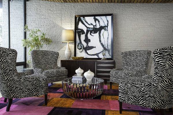
This renovation design project with interior design by LaMar Lisman’s office showing a great use of color was recently featured in Utah Style and Design magazine in the Winter 2014 issue. (Lisman Studio, utahstyleanddesign.com)
Color preferences are personal and may be even subconscious. To determine your favorite colors, think of things you like and what color they are. Is your favorite apple a bright, shiny red or crisp, clean green? Think of a favorite piece of furniture or an accent piece you especially enjoy. Which colors do you look best in and wear most often?
Color is also a psychological thermostat. Some colors are “hot” or energizing, such as red, orange and yellow. Other are cool and calming, such as blue, green and purple. Cooler colors make a space appear larger while warmer colors make a space feel cozier.
It’s generally best to put cool colors in places where you want peace and relaxation, such as bedrooms and formal living areas. Warm colors can be where the action is, like the kitchen or a play room.
Dark colors absorb light, creating intimate spaces. They can be used in a small space to intensify the cozy atmosphere or in a large, sunny space to add intimacy. Dark colors on the ceiling will make it feel lower, which may make a space feel either cozy or cramped — exactly why you need to carefully consider the consequences of the color choices you make.
For your floors, lighter colors will make a room seem bigger. A highly polished wood floor will reflect light throughout a room, adding interest and variety to the space. Darker colors, especially in area rugs, can add drama and intimacy.
Your whole home should have a coordinated color scheme. You don’t want to go to either extreme — one color throughout or a different color in every room. It’s best to choose a few coordinating colors and use various shades in different locations. Watch how the spaces flow into each other so color changes feel natural as you move throughout the house.
LaMar Lisman, CEO of Lisman Studio Interior Design in Salt Lake City, suggests choosing a color scheme from nature. “Look at nature,” he said. “The colors in nature are always popular and never date.”
It is important for your exterior color to blend in with the nature in the area. For example, a bright pink is not found in northern Utah’s natural landscape, so a house of that color would stick out in our natural environment. That same bright pink house will blend in better somewhere like St. George.
The main structure of the house is not the place to make color statements, Lisman says. If you go with more natural colors on the more permanent surfaces, then you can make your bold color statements with the accessories — lamps, artwork, plants, pillows or rugs. “You can change those things as the trends come and go,” he said.
If you want a trendy color on the wall, such as a citrus orange or a bright blue, limit it to an accent wall. Accent walls should play up the architecture. Dramatic walls in the house, such as a two-story wall or a wall with a fireplace, make good accent walls. However, you do not need an accent wall in every room of your house. They should serve a purpose and complement a significant space. Obviously, one accent wall is easier to change than a whole house when the color goes out of style.
We often have people contact us regarding photos we have on Houzz.com asking for information on paint colors. Remember that most photographs will alter the true color of any room, not to mention the act of printing or publishing a photograph online. If you like the color you see, don’t worry about what the actual color is; try to find a color that matches what the picture shows. A handy tool is an app from Benjamin Moore called Color Capture. You can take a photograph of anything you like and it will show you a selection of their paint colors that are similar. Other paint companies may have something similar.
Many paint companies have larger swatches or small amounts of paint you can purchase to test at home. The light in a room will significantly change the appearance of any color, so don’t make your final decision in the paint store or you may be disappointed when you apply the paint to your walls.
Good paint is not cheap these days, but in the grand scheme of things it is one of the least expensive materials involved in a renovation project. Be a little brave and have a little fun with your paint selections. If you make a mistake, paint over it!
Ann Robinson and Annie V. Schwemmer are the Principal Architects and co-founders of a residential architectural firm focused on life-changing remodeling designs at RenovationDesignGroup.com. Send comments or questions to as*@*******************up.com


